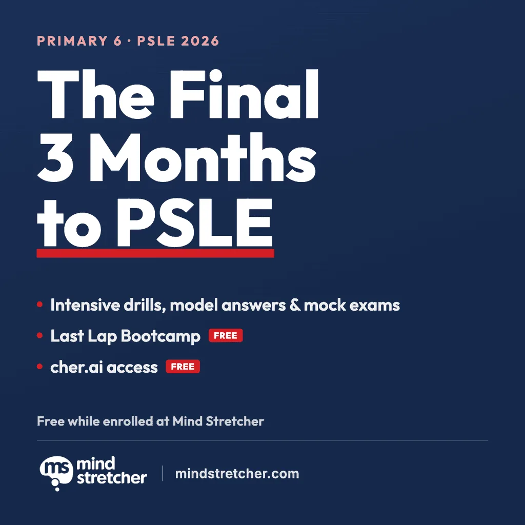
The Final 3 Months to PSLE
Primary 6 lessons move fully into exam preparation across all four subjects, with Last Lap Bootcamp and cher.ai free while enrolled.
Find out more →Mind Stretcher · Homepage style lab
One navy-led system: a deeper premium navy, a readable Euclid display type scale with the Market Pro script kept for the hero headline, a standardised button set, and a small kit of reusable components. Everything below is the real component, live — what you see is what future pages get. The homepage at mindstretcher.com is built on this system.
Every page is built from the same shell. Take content from live verbatim; do not inherit live's per-page chrome. Where a live section genuinely carries meaning — a carousel, a closing CTA band, a two-column hero photo — port that section into this template.
<SiteChrome /> (announcement bar +
navbar) → <main> → <Footer />. The footer is our dark
navy band sitewide; live's is white. Standing decision — don't re-litigate per page.--pad
(desktop 100 / laptop + tablet 50 / phone 24).<810,
tablet 810–1023, laptop 1024–1439, desktop ≥1440.
Check all three of 390 / 810 / 1440 — past misses existed at one width only.--display-script). Used on /perks, /careers, course and
level pages.--display). Used on /links, /app-privacy-policy, /404 and other pages that
are being read rather than sold.border-radius: 120px 24px 24px 24px). Below 1024 it becomes ONE CENTRED
column with the photo first, then the headline — the same order as the
course leaf heroes.--display-script) is the marketing hero headline
and nothing else — not section headings, not the closing band, not cards. Everything else
is Euclid Bold (--display). /careers was using it twice, in its hero
and its closing band, which no other page does (John, 2026-08-01). Enforced by
node scripts/maintain/check-contrast.mjs --all.color: #fff !important.
global.css sets h1, h2, .h2, … { color: var(--ms-navy) !important }
sitewide, so a scoped rule loses and the heading renders navy-on-navy — invisible, while
still passing the text-parity gate. This has shipped once. Run
node scripts/maintain/check-contrast.mjs --all.border-radius: var(--r-card) (10px). Hero photos, card photos, worksheet
shots, carousel frames: all the same.
Two shared classes in global.css — .filter-chips for the strip and
.filter-chip for each button — used by the blog tag strip, the careers
department filter, the locations region filter and the perks category filter. There used to
be four hand-rolled copies that had drifted apart: locations ran 16px Medium with no fill
and an 8px gap, blog 13px, careers 14px, perks plain text copied from live; two were centred
and two left-aligned. Standardised on the blog/careers treatment, centred, 2026-08-01 (John).
.filter-chips — flex, wraps, centred,
10px gap. Centred on every page, under the (centred) section heading. Don't re-align it
per page; that is the drift this replaced.--surface
fill, 1px --border, fully rounded, 8px/18px padding.
Active: navy fill, white text..btags__chip, .dir__tab…) and add the shared classes for
appearance. Page-specific layout — blog's 860px width cap, section margins — stays local.--ms-navy, centred, 72–80px padding, white heading and body copy,
one white pill button (variant="primary" onDark)..crcta on /careers, .rgcta on /registration,
.pkpartner on /perks. Where live uses its own page-specific blue, we use the
brand token.Navy leads. Red is the single accent — eyebrows and inline links only, never a button fill.
Navy (primary)
Navy deep
Red (accent)
Ink (body)
Surface tint
Border
Two display faces, and the split is by role, not by page. The
Market Pro brush script (--display-script) is the brand
signature, and the hero band headline is the brand slot — so it runs on the hero H1 of every
marketing page, homepage and course pages alike. It stops there: it is scoped to the hero
classes rather than to h1, because it earns its keep on a short branded headline
at 34px and up, and would hurt on a long blog title or a utility page. Everything else —
section headings, sub-heads, labels and body — is Euclid, with headings on
the Bold cut (--display).
Euclid ships a real italic cut (--font-italic), so a pull quote is a
genuine italic rather than a slanted Bold. Use it sparingly — the editorial pull quote is the
main case. Headings stay upright: italic is not part of the display set.
Radius is "Crisp" — editorial-premium without going cold. Every component reads these tokens, so the whole system re-rounds from one place. Circular is reserved for icon buttons (carousel arrows).
Button
Card / photo
Tag
Input
One shape. Two contexts. Two roles, plus a tertiary text link. That is the whole system.
On light sections
Tertiary text link →On dark / photo sections
variant="primary".variant="secondary".onDark — primary inverts to white-filled, secondary becomes a ghost outline.variant="cta") is the ONE red-filled button in the system,
and it exists only on campaign pages — the single action that page is there to produce. John's call
(2026-08-01): live called this out in red and it was doing real work. It stays rare on purpose; a
second red button on the same screen cancels the first. Everywhere else the primary action is navy.target="_blank" + rel="noopener noreferrer" for any http(s):// or .pdf href). In-site navigation and in-page anchors stay in the same tab, preserving the browser-back convention. Pass an explicit target to override.
Borderless editorial card — image, optional tag, title, teaser, red CTA. The image radius, tag and
type all read tokens. Set --sl-lines / --sl-title-lines on the container to
reserve consistent heights so every CTA lines up across a row.
Primary 6 lessons move fully into exam preparation across all four subjects, with Last Lap Bootcamp and cher.ai free while enrolled.
Find out more →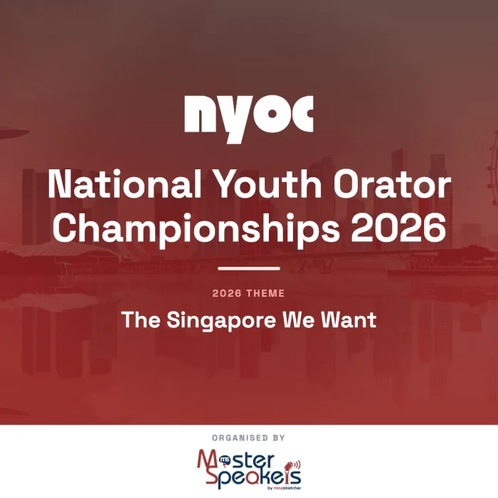
Entries close 13 September, or 18 October for Primary 6. Over 500 students took part in 2025. Primary to University, free to join.
Register Now → Limited slots available!
 Open houses run from August to September at eight centres, including our new Jurong Point, Bukit Timah and Clementi centres.
Register Now →image, title, body, href, cta, tag?, ratio?.ratio="1 / 1" for promos; landscape (e.g. "285 / 200") for level photos.Pure-CSS scroll-snap row of cards (no library). Navy circular arrows on laptop and desktop; on phones the arrows drop and a swipe hint appears. Drives "What's Happening" on the home page.
Primary 6 lessons move fully into exam preparation across all four subjects, with Last Lap Bootcamp and cher.ai free while enrolled.
Find out more → Entries close 13 September, or 18 October for Primary 6. Over 500 students took part in 2025. Primary to University, free to join.
Register Now → Limited slots available! Open houses run from August to September at eight centres, including our new Jurong Point, Bukit Timah and Clementi centres.
Register Now →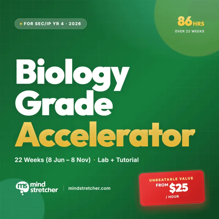 Limited slots, from $25 per hour
 86 hours of O-Level Biology preparation over 22 weeks, with weekly lab practicals and tutorials across all three papers.
Register Now →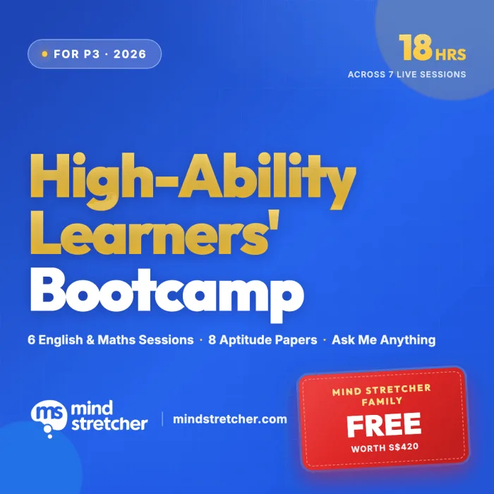
An 18-hour online bootcamp for the August 2026 High-Ability Learners Identification Exercise. Free for our P3 students.
Find out more →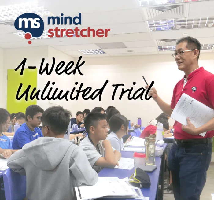 Limited time only
 A week of unlimited classes across Pre-Primary, Primary and Secondary, for $107.91 ($99 + GST). T&Cs apply.
Book now → Limited time only
 Try a free class at Punggol Coast Mall or Northshore, with up to 20% off monthly fees when you bundle subjects.
Find out more →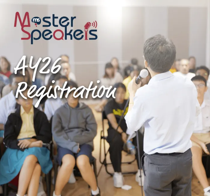
Build communication, presentation and interview skills for Academic Year 2026, with more than $1,000 in savings.
Find out more →perView (cards per view, default 4), gap, label.perView.Infinite ticker. Slot the items once — a bundled script clones them for a seamless loop, so you never duplicate markup. Pauses on hover and respects reduced-motion. Drives the "We've been featured in" strip.







speed (seconds per loop, default 120), gap, label,
reverse (scroll right — for two stacked rows drifting in opposite directions).height with width: auto, run the strip
full-bleed (margin: 0 calc(50% - 50vw)), and let it carry the whole set. 200px tall on
laptop and desktop, 150px on phones (/achievement-awards, /registration). Reserve
Carousel — which costs arrows, a swipe hint and a decision — for cards a visitor is
meant to READ, like testimonials or programme cards (John, 2026-08-02).
Hairline-divided question rows with a plus that folds to a minus — FaqAccordion, built on native
<details> so every answer ships in the HTML.
Question-and-answer lists: page FAQs, policy explainers. First used on /fees; the sitewide FAQ page reuses it as-is.
Answers are always in the HTML — search engines index them, the text-parity gate can read them, and the accordion works before (or without) JavaScript.
items — [{ q, a }]. Content comes from a data file (e.g. src/data/fees.js), never hardcoded.--font-bold; answers body ink. No red — the accordion is structure, not accent.wide to drop the column.ctas array per item,
rendered as outlined buttons under the prose. Live's /registration answers "How do I
enrol my child?" with two buttons, and "Where do I view all the schedules?" with a button and
no prose at all, so an item can legitimately have buttons and an empty answer.An image that runs edge-to-edge, breaking out of the content column — the worksheet collages on the level pages ("Our Commitment to PSLE Excellence"). John's call (2026-08-01): keep this variation — a page of uniformly boxed images is monotonous.
<img> OUTSIDE .container: width: 100%, no border-radius, no card chrome, no scrim.loading="lazy" below the fold; source ~1800px wide (2× its ~900px desktop render)./levels/p5 and the stage hubs' worksheet band.The hero keeps the video. Two bands — Track Record and the closing CTA — become full-bleed achievement-awards crowd photos under a flat navy scrim, to convey scale and occasion. Content sections stay clean light surfaces so the photography lands as a deliberate accent, not wallpaper.
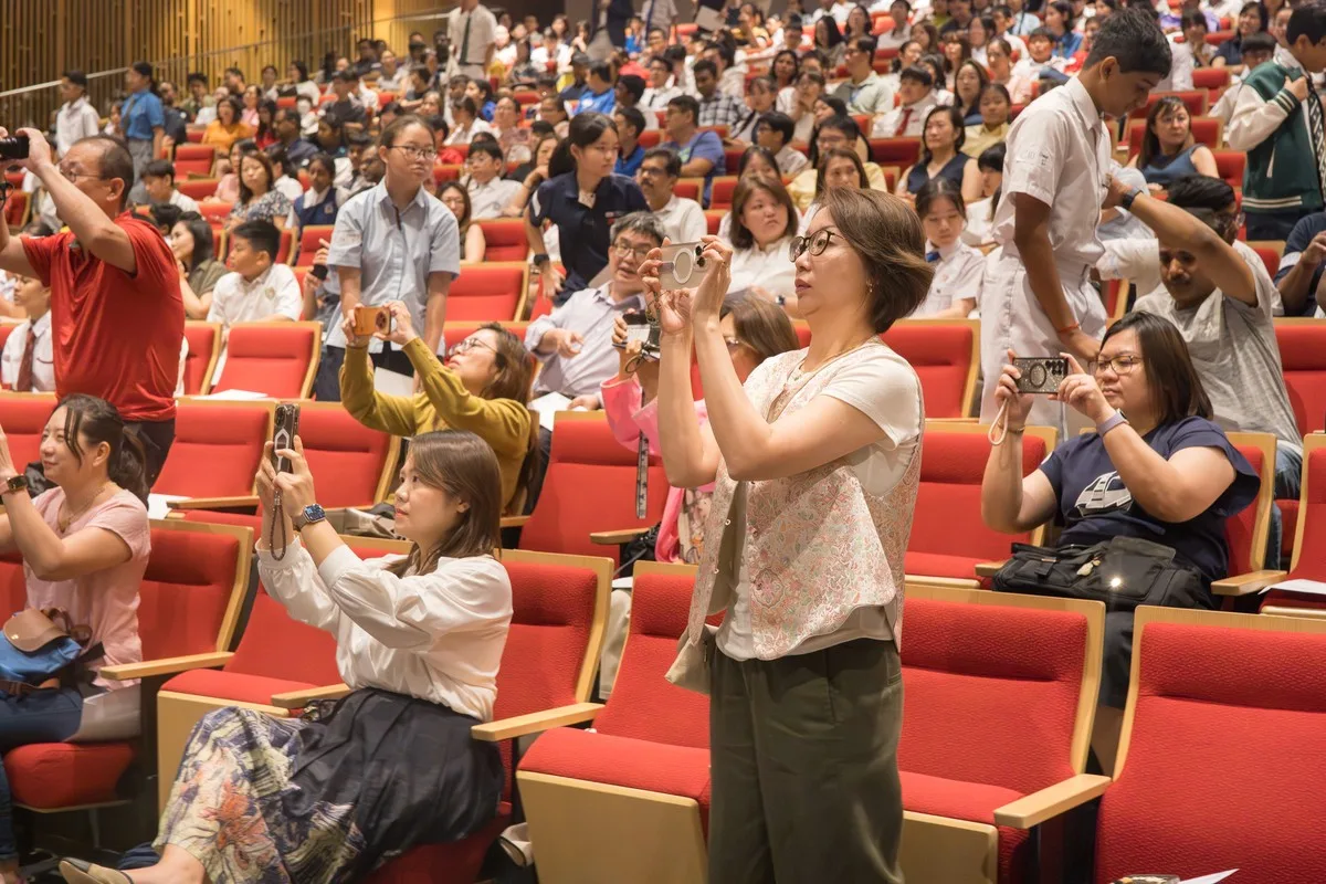
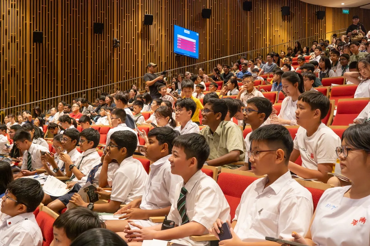

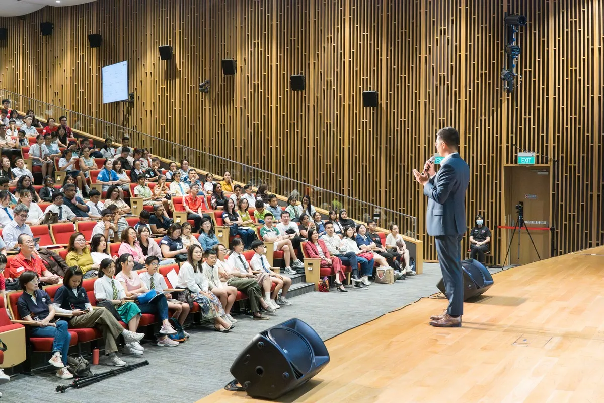
Photo stack — tap, click, swipe or use the arrow keys to send the front photo flying and reveal the next. A reusable component for galleries and event recaps.
images (front-to-back), ratio?, label?.A second vocabulary, for pages whose job is to get someone to register — the promo pages (/psle-power-up-programme and its siblings). John's call (2026-08-01): "pages that are like psle-power-up should be conversion focused and not just force-fixed into the standard site template." So these keep our brand in full — navy and red, Euclid and Market Pro, the same buttons and radii — but not the standard content-page layout.
--text-body, 17px), not
--text-lead (19px). Lead is for a SHORT section sub-head — which is what the homepage
uses it for. A campaign intro is a two or three line explanatory paragraph, and at lead size it reads
as heavy as the heading above it.LocationsDirectory takes initial=6 to show
six cards behind a "Load More", and nested to drop its branch names from a top-level
heading to a sub-heading. /registration uses both; /locations uses
neither. All 30 cards stay in the HTML either way, so the page works with JavaScript off and
search engines see everything.src/components/campaign/. Content comes from a data file generated
from live — never hand-typed.
Colour-coding a subject carries meaning — a parent scans six cards for "Maths" and finds it by
colour before reading a word — so it is part of the system, not decoration. These alias the accents
already in global.css; no new hues enter the brand.
English
Maths
Science
Chinese
No subject
--subject-default (navy).23 Hours
17 Hours
17 Hours
One component, four grounds — so a band never has to fight whatever sits above it. The rule that matters: a band cannot repeat the ground it follows. A navy strip under a navy hero merges into one very tall dark block, which is what made the first build of /psle-power-up-programme feel heavy.
tone="tint" — a quiet wash, navy text, hairline dividers. The default,
and the right answer after a navy hero. Live uses exactly this for its claim strip on
/final-sprint-to-psle.tone="navy" — the dark strip. Strong, but only where the section above it is light.tone="red" — the loudest thing in the system. At most once per page, and never
beside the Register button, which is also red. Pairs with numbered, as on live's
1-2-3 strip.tone="plain" — white, hairlines top and bottom. The lightest.variant="feature" is for
the claims a page LEADS with; variant="quiet" is the subtle row — ONE compact centred
line, small semibold items separated by short thin hairlines, matching live's own trust bar — for
trust strips ("20+ years of proven results…") and soft callouts that support the page rather than
headline it. If the row is reassurance rather than an argument, it is quiet.rule="red" — a red rule down the left,
the site's own stat marker from /fees and the homepage. Label-led claims
take rule="divider", so the row reads as one object.panel turns the band into a rounded card inside a section rather than a
full-bleed strip — the red numbered 1-2-3 device on
/final-sprint-to-psle. It runs denser than a band: card-title type on
tight padding. Shown second below, which is the form the page actually ships.--ms-navy-line only on navy; tint takes --border and
red a white 28%. This bit us twice: the divider moves from the left edge to the top edge at
809px, and for a while only the left-edge colour was toned — so tinted bands drew dark navy hairlines on
a light ground, and the red panel ruled itself in navy (John, 2026-08-02).Strategic, Exam-Focused Coverage
Trending questions, exam techniques, answer frameworks & more
89.5 Hours of PSLE Preparation
Across all 5 subjects this June
From $242 Per Subject
Mind Stretcher student rate, online bootcamp
Exam-ready frameworks & model answers
To deploy straight in the exam
Intensive drilling
Every topic and question type, at full PSLE difficulty
Full mock exams
Under real conditions, including Oral and Listening
A campaign page runs 6,000px and more. One flat white scroll reads as a wall, so sections alternate
white → --surface tint → a full-bleed --ms-navy-deep band. Navy is not
rationed to content pages or to one use per page (John, 2026-08-01) — the only rule is that two bands
never sit back-to-back, because they merge into one very tall dark block. Figures come in two forms,
below; the navy band shown here is the label-led one.
2 in 3
Achieved AL1 & AL2 in their Mind Stretcher subjects
50%+
Achieved a PSLE score of 8 and lower
35%
Scored AL1 in their Mind Stretcher subjects
Two devices, both from /final-sprint-to-psle. A drawn, handwriting-style stroke was tried and dropped — it looked odd (John, 2026-08-01) — so the rule is straight. Both take any accent, red by default, and both are opt-in per section: applying them to every intro automatically turned an accent into wallpaper.
variant="rule" / "inline") — a straight underline,
running unbroken through descenders. Best on a short phrase; under six or seven words it starts to
read as a link.variant="marker") — a highlighter wash behind the lower band of
the words, the same gradient technique live uses. Softer, and it carries a long phrase without
looking like a link. This is what the section intros use.Revise. Consolidate. Excel.
A full 89.5 hours of preparation
English, Maths, Science, Chinese & Higher Chinese
89.5 hours of exam-focused preparation
The inline variant is the same rule at body-copy weight, for an emphasised phrase inside a
sentence: “our Primary 6 lessons move fully into exam preparation,
with an intensive bootcamp over the September holidays.” Section intros on light grounds pick this up
automatically wherever the copy is bold.
Tabs and toggles are switches, not buttons: a recessed tinted track with a raised white pill on the selected segment. They used to be navy-filled when selected, which read as a second primary button sitting next to the real one (John, 2026-08-01). A filled button says "do this"; a segmented control says "pick one of these". Live examples: the subject tabs and the two fee toggles on /psle-power-up-programme.
They stay ONE row on phones (John, 2026-08-02) — the padding tightens and the label drops
to --text-xs, but the strip never wraps into a 2×2 block, because a control only reads as one
control while it stays one strip. Four one-word segments fit at 320px. If labels are long enough that they
genuinely cannot, that is a sign the tabs want shorter names, not a second row. Two components share this
behaviour: SubjectTabs (exam-pack content) and Tabs (free-form panels, e.g.
/final-sprint-to-psle) — keep them in step.
Schedules and fee matrices stay light. A solid navy header bar with white text and zebra-striped rows turns a schedule into a wall of chrome (John, 2026-08-01) — live's own tables are far quieter and they are right. The rules: a tinted header with small grey uppercase labels and a single bottom border; no striping; one hairline between rows and none after the last; the leading value in each cell emphasised and its supporting value quiet beneath it (the date reads first, the time supports it). Subject dots are circles, so they read as a marker beside the name rather than a second chip competing with the ones on the cards. Below 810 the table keeps its shape and scrolls sideways inside its own container, with the first column pinned — the page body never scrolls horizontally.
<br>: the label leads in semibold
uppercase, and the second line — a place, a venue — sits under it in regular weight and sentence case.
Flattening both into one uppercase run loses the hierarchy.<td> in some tables, on an inner <span> in
others — and reading only one of them left half the schedules unstyled. Dates lead in semibold navy,
times support in grey.Whether it's a student or a teacher, the name leads — bold, and a clear step larger than anything under it. The role or school sits smaller and quiet, and the bio smaller again. Our first version had the name, the role and the bio within a whisker of each other in size, with the role in red, so the loudest thing on the card was a job title (John, 2026-08-01).
--ink-soft, never red.
Bio / quote 13px, --ink-soft.Components added while building /one-week-trial, /promotions, /student-referral-programme, /punggol-coast-northshore-promo, /achievement-awards and /mentorship. Same rule as the rest of the kit: solve it once here, never inline on one page.
IconList — the promo pages' workhorse list: filled navy circle carrying a drawn tick
or the item's number, text hanging right, hairlines between items, bold lead-in phrases in navy.
The circle top-aligns against wrapped text, as live does. Ticks are drawn in CSS,
never typed — a ✓ character leaks into the copy the text-parity gate reads.SubjectListCard — level card with subject chip-rows (/one-week-trial and the Punggol
page's "Available Subjects"). The rule under the card title is full width —
deliberately distinct from the section-heading device; live keeps the two apart on both pages.
These grids stack to ONE column below desktop — a 2+1 row orphans the third card.PromoCard — offer card: value chip above a centred title, optional big red offer
line (red marks money on these cards, matching live), left-aligned body, quiet note, red CTA
pinned to the card foot so a row of unequal bodies still lines up. featured adds the
navy border live uses to single out its biggest saving — at most one per grid.CampaignCta — the closing deep-navy band every promo page ends on (the flagship's
treatment, extracted). ONE red conversion button; further actions render as ghost buttons. Give it
id="register" and point the mobile StickyCta at it.CampaignHero pills — offer-value chips under the hero copy ("$107.91 / ($99 + 9%
GST)", "FREE Trial Class / Limited time only"). Claims, not actions: hairline chips, never a red
fill — a red chip beside the red Register button reads as two buttons.PersonCard initials — avatar fallback when there is no photo: a navy disc with the
person's initials (the Punggol testimonials). Navy, not red.PersonCard layout="photo" — the one shape whose portrait
is not a circle. A full-width 5:4 photo across the top of the card, a hairline under it,
then the quote and the name. Use it when the photograph is the point — a student on results day,
with their family — because an 84px circle throws that away (John, 2026-08-02, /registration). The
crop is anchored near the TOP: several of these are portrait-format with faces in the upper third
and a centred crop beheads them, the same lesson the /mentorship roster learned twice. Pair it with
Carousel rather than a grid; five quotes of different lengths in a row need the
carousel's equal-height stretch, which is why the variant overrides the base card's
height: 100% back to auto.
On phones the photo stays edge to edge and the body tightens to 16px. The generic
phone card padding inset the photo 18px inside its own card, which on a 280px card reads as a
picture in a frame in a frame, and 24px of side padding squeezed the quote into a column (John,
2026-08-02).ProofBand bare — renders the band as a bare row inside a CampaignSection
(no padding or ground of its own) so a stat row can sit under a section heading without
double-padding. Marquee reverse — scroll right instead of left, for two stacked photo
rows drifting in opposite directions (/achievement-awards). FaqAccordion answers accept
a box part — an inset tinted panel for worked examples (/one-week-trial).align-items: start without cause): a short card beside a tall one reads as
"random boxes" (John, 2026-08-01). Top-align only where ragged heights are the design, e.g.
/mentorship's roster.fill — Biology GAP's week column), and a full-width row
can carry mark: 'alert' — a pale red wash with crimson text for exam dates and other
checkpoints.
Card chips carry different brand accents, one per card in order. Four chips in the same
blue-grey read as dull and tell a scanning parent nothing apart. The chip is a 10% tint of the accent
with the accent as its text colour — never a solid fill, which would compete with the red Register
button. Available tones: navy, red, blue, orange, green, grey.
The offer card is the standard card plus two campaign additions: a tag chip, and an inset "what's
included" list. The comparison table sets us against the alternatives — ours is the emphasised side;
the other column stays quiet grey, never red (red is the brand's single accent and spending it on a
competitor would be the wrong signal). Ticks and crosses are DRAWN, not typed, so they can't leak into
the copy the text-parity gate reads.
Small class
4 × 2-hour lessons per subject (8 hours total)
Exam skills mastery sessions conducted in a small-class setting.
Included per subject
4 Weekly Small-Class Lessons
8 hours per subject.
Available for English, Maths, Science & Chinese.